You've done it, you closed a deal! The best part...seeing the Graphly dashboard on the big screen TV in your office refresh with another won deal and the bump in revenue tied to it.
A New Report While we've long had a view for won opportunities combined with a future forecast, we've recently had a few requests to break out won opportunities into their own report. So that's exactly what we did.
Won Opportunities The Won Opportunities report allows you to see the quantity and revenue associated with opportunities moved into a won stage during a date range of your choosing. Knowing Keap users vary greatly in how they utilize opportunity records, we've included options for recording revenue and counting a deal as closed.
Revenue Calculation Calculate the revenue from your opportunities using the selected products on the opportunity, the projected high, the projected low, the average of the projected high and low, or an opportunity field storing a value.
Won Consideration Define an opportunity as being won using the estimated close date or the date the opportunity was moved into the won stage.
Recommended Report Once you have the Won Opportunities report all configured, might we suggest you place the Opportunity Forecast report right alongside it?
That makes 17 opportunity-specific reports in total. We help organizations understand bottlenecks in their sales process, improve performance, and obtain the sales outcomes they're after. Do you see something we're missing that would help you and your team be more successful? Just drop us a line or even better, submit a Feature Request.
Master Your Revenue Growth with Graphly's New NRR and Forecast Reports
Understanding your business’s financial health goes beyond just looking at new sales. The key to sustained growth for subscription-based businesses lies in retaining and expanding customer revenue, which is why Net Revenue Retention (NRR) becomes a crucial metric.
Why NRR Matters: Net Revenue Retention measures the percentage of recurring revenue retained from customers in a given period, considering upsells, cross-sells, downgrades, and churn. A strong NRR signifies a healthy business, product value, and customer satisfaction.
Variables to Consider:
Starting MRR (what your monthly recurring revenue was at the very beginning of your date range)
New MRR (new monthly recurring revenue as tracked by Keap subscriptions)
Expansion MRR (Keap subscription records that increased in amount during your date range)
Upgrades (one-time product purchases that occur during your date range)
Contraction MRR (Keap subscription records that decreased in amount during your date range)
Churn MRR (Keap subscription records that are set to inactive during your date range)
Refunds (any Keap invoice that is refunded during your date range)
Subscription Best Practices: You may notice from the variables above that there's an expectation that subscriptions that increase/decrease their monthly amount do so by updating the dollar value of their original subscription. After consulting with hundreds of businesses on recurring revenue, we've certainly come across numerous businesses whose process is to cancel one subscription just to immediately create a new subscription at either a higher or lower dollar amount. Taking this latter approach throws off your churn, average duration, stick rate, lifetime value, and even new customer reports. We highly recommend improving your processes to update the existing subscription record when a subscriber is either increasing or decreasing their spend with you instead of canceling their subscription.
Calculating NRR: To calculate NRR, you subtract the revenue lost from churn and downgrades from the revenue gained through new customer revenue and existing customer expansions and then divide by the total revenue at the start of the period. This result, multiplied by 100, gives you the NRR percentage. A rate over 100% is a beacon of business health, showing that your growth from existing customers outweighs any losses.
Graphly Simplifies NRR Reporting: As you can see, there are many factors in calculating NRR; it's a constantly moving target as performance improves or declines in any of the seven variables. Recognizing the importance of this metric, we’ve developed the Net Revenue Retention Report. This report can be configured just once but will provide ongoing updates, automating the calculation and providing you with instant insights into how well you’re maintaining and expanding your customer base. No more manual calculations or spreadsheets, just insights that help you strategize and act.
Two Views, a Graphly First This report is so valuable that we decided to build the ability to choose between a chart and a table. For those who want a quick reference, "are we positive or negative, and by how much?", choose the chart option. For others who want the nitty-gritty breakdown to see where improvements can be made, select the table option. Some users may do both and place reports side-by-side or one on top of the other.
Predicting Future Growth with NRR Forecast: Alongside our NRR report, we’ve introduced the Net Revenue Retention Forecast Report. This forward-looking report lets you input various NRR rates to project future revenue growth. By setting different NRR goals, you can see potential future outcomes, aiding in strategic planning and goal setting.
These two new reports are designed to empower your business with the data needed to make informed decisions that drive retention and growth. They underscore our commitment to providing tools that track your business’s past and present and predict and improve your future.
Experience the new standard in revenue retention analysis with Graphly today and see why effective NRR management is a game-changer for your business.
* This update includes similar-sounding and looking terms: NRR (Net Revenue Retention) and MRR (Monthly Recurring Revenue). While confusion between the two acronyms comes more often from verbal discussions, we wish to note the distinction here.
Are you maximizing the impact of your email marketing campaigns? Until now, understanding the effectiveness of different email strategies might have felt like navigating in the dark. But not anymore! We’re excited to introduce three new reports designed to shine a light on your email marketing efforts, helping you make data-driven decisions to enhance your engagement and conversions.
1. Email Engagement Report Dive into the essentials of email marketing with our Email Engagement Report. This report allows you to compare the performance of multiple emails for the most common email stats (eg., open rates and click-to-open rates). Identify top-performing emails and understand what captures your audience’s attention.
2. Email Comparison Report Put your emails to the test with our Email Comparison Report. This report lets you place the metrics of multiple emails side by side. Whether you’re analyzing open rates, clicks, or any other critical metric (9 available), see how each email stacks up against the others so you can improve low-performing emails and replicate your success by doing more of what you did in the high-performing emails.
3. Email Performance Report Track the long-term success of your campaigns with the Email Performance Report. Select an email and a specific metric—be it clicks, opens, bounces, or engagement rates (again, 9 unique metrics are available)—and watch how it performs over time. This longitudinal view helps you gauge the enduring effectiveness of your content so you can adjust your tactics for better results.
Each of these reports is designed to provide clarity and actionable data, helping you optimize your email marketing strategies like never before. Start turning your insights into actions today and watch your email marketing ROI soar!
Prerequisite: In order for Graphly to render these valuable reports, you must ensure you've set up and selected your Keap Email saved searches here inside of Graphly: Gear Icon > Account > Keap > Select 4 saved searches.
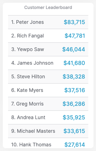
Unveil Your Top Customers with the New Customer Leaderboard Report
Do you know who your top 10 spenders are? With our latest feature update, discovering your most valuable customers has never been easier.
Introducing the Customer Leaderboard Report — a dynamic report designed to highlight your highest-paying customers. Whether you're looking at all-time greats, this year's leaders, last month's top spenders, or even this week's front runners, this report brings their details to the forefront.
Flexible Metrics for Tailored Insights: Choose how you define a leader by selecting to calculate revenue based on total amounts or average values, and decide whether to base the calculation on invoices issued or payments received.
Totaling the amounts shows customers who have already brought incredible value to your business. In contrast, averaging values shows customers who may bring significant revenue to your business in the future, should you retain them as customers.
Discover Hidden Opportunities: Flip the script by sorting from the lowest to the highest revenue. This reverse view helps you identify customers who may not be your top spenders but hold significant potential for upselling or more personalized engagement.
With this new report, you're equipped to recognize your most impactful customers and uncover untapped opportunities within your customer base.
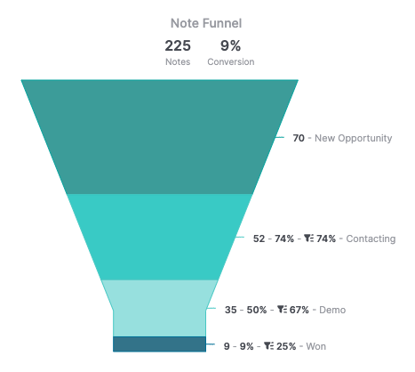
We're pleased to share the release of two new note reports: Note Funnel and Time Between Notes
Our Tag Funnel and Opportunity Funnel reports have been very popular among Graphly customers. But for those not using a sales pipeline who wish to track a process that a contact can go through more than once, the best data point is note records, which get timestamped each time they're added to the contact record in Keap.
Note Funnel The note funnel report can be used to track any funnel or process inside of your business. As long as you apply a note record to the contact at each journey step, Graphly will provide you with valuable insights.
At the top of the image above, you'll see the total number of notes for the date range and the overall conversion. Then, for each note or step in your process, you'll see the number of notes applied, the conversion from the top of the funnel to that point, and the conversion from the previous stage.
Understanding these individual conversions helps you understand where your bottlenecks are and how to improve the overall flow of a process.
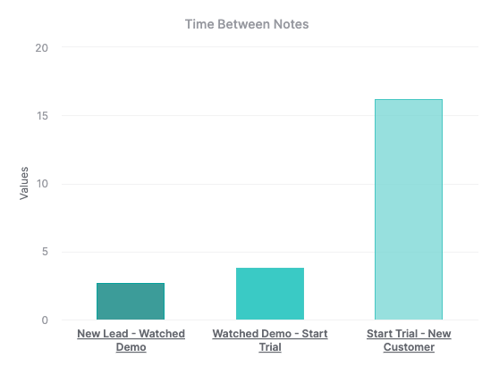
Time Between Notes Graphly will calculate the average time between each note displayed using the same note records. In addition to measuring conversions from note to note, understanding the time it takes between notes helps you strengthen the individual steps, making your overall process more efficient.
Click on any of the columns in the report to see an expanded view with far more granular timelines.
In addition to these new reports, we have 5 other reports that slice and dice note data in different ways. Visit your account now to add these reports to your dashboards.
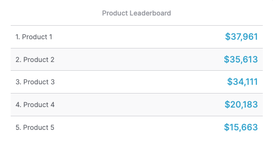
Over the years, we've created numerous leaderboard reports to help Graphly users identify the winners or "leaders" in their business.
This update includes 3 new reports to help businesses identify winning products and rank them in a leaderboard fashion. Here are the reports:
Product Leaderboard This report shows a leaderboard sorted by products sold during a specific date range. Graphly will highlight your best products, whether you define a leader as a product with the most units sold, the highest revenue, or the average revenue per product.
Grouped Product Leaderboard This report is great for when multiple products represent a single offering. It, too, shows a leaderboard sorted by products sold during a specific date range, with the ability to group multiple products into one leader. So whether you have unique plans for the same service, unique SKUs for size/color variations, or even unique product records for varying prices, grouping allows for consolidation so you can still see leading products.
Product Category Leaderboard Do you have a wide range of products that have been carefully organized into categories? Excellent! Now, you can compare your various product categories to determine the leaders based on sales during a specific date range.
Our Help Docs provide further documentation on setting these reports up. They're all live in your Graphly account, so check them out and chat with us if you have any questions.
This is just the beginning of what will be a rapid series of valuable updates coming to Graphly. We're practically tripling our development bandwidth to bring you more reports and features we've only previously dreamt of offering.
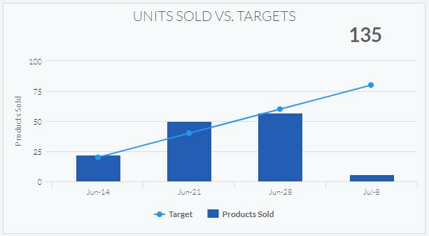
Looking to easily compare your number of units sold to target numbers you wish to hit... now you can!
Compare the number of units sold for all products you select vs. target numbers you wish to reach over a given date range.
You can customize which products to track, the date ranges and the target numbers you wish to set too quickly and easily see how your real numbers are performing compared to your targeted numbers.
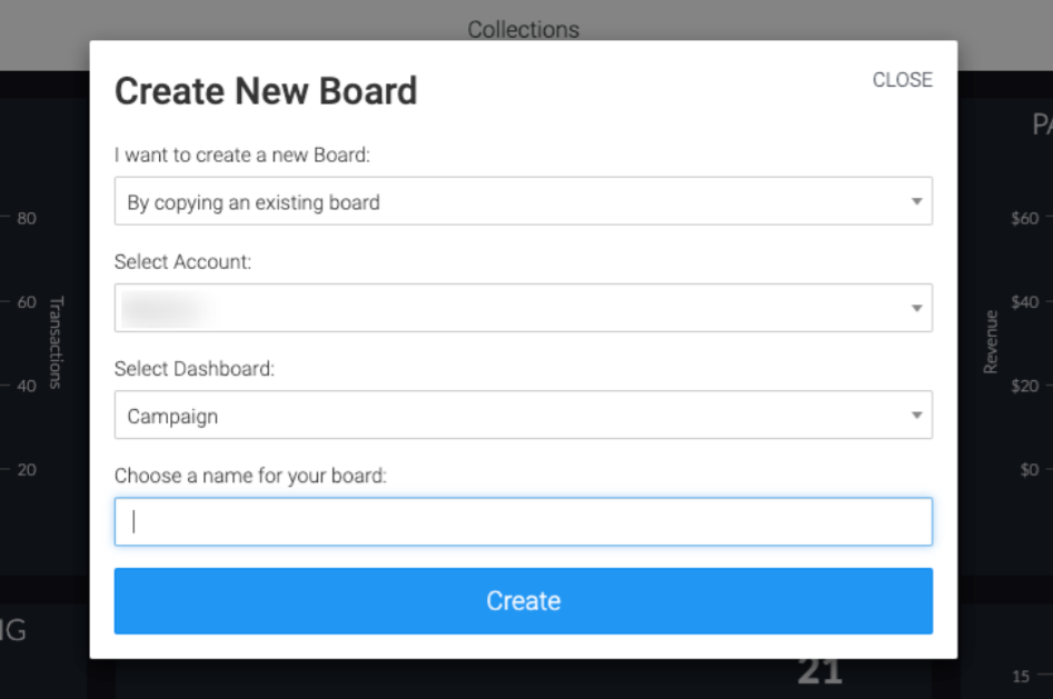
You can now copy a dashboard from your Graphly account to any other Graphly account you have access to! To learn more about this feature check out this help article.


 Powered by FeedBear